 |
||||||
| May 24, 2005
Interference Pigments for Floors
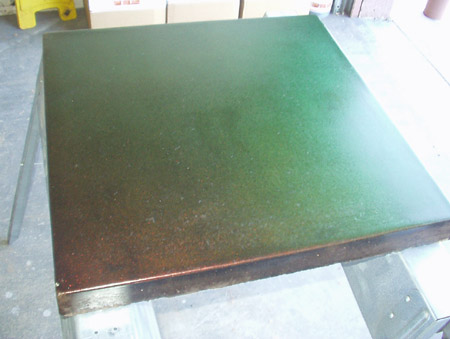
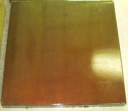
I'll never forget the first time a saw a vehicle painted with interference colors. I pulled up next to what looked like a glowing pink car, but as I moved closer to it the car became light green. I thought my polarized sunglasses were messing with my vision, so I raised them and looked again. Every time I moved my head or looked at a different angle on the car, I saw the color shift between pink and green. These two colors are complements (opposites) on the color wheel. I realized that the guys in the lab coats had done it again – they had come up with a paint finish even more remarkable than the old “metal flake” look, or the newer pearlescent colors. These paints need to be seen to be believed. The colors are fleeting and resemble a butterfly wing in motion. Pearlescent colors are lovely and shifting, and have been around (especially in women’s cosmetics) for centuries. Interference colors add even more movement and three-dimensionality, and on a light background, they may also give a pearlescent feeling. Recently, the Dayton Superior Company sent us two jars of what looked like a pearly gold sealer to try out. They told us to try it over black concrete for the strongest effect. We stained a 2’x2’ sample paver as dark as we could get it. We then sealed the paver with Dayton’s Super Seal. This is a clear solvent-based acrylic sealer which we are using more frequently now. It smells like Paint Thinner, but it penetrates and darkens your stains and is reputed to be as durable as are the more familiar solvent-sealers which use lacquer thinner or xylene as a vehicle. When the Super Seal had cured, we applied two coats of the new interference sealer. We used a China bristle brush the first time and found that to be a mistake. The brush strokes all showed and this detracted from the magic of the interference effect. Now we use a small paint roller made out of a very fine latex sponge. The idea is to apply it very evenly. When this was dry we put another coat of clear Super Seal over it for protection. I took photos, but the effect is something which cannot be clearly represented by a still photograph. Our black paver appears to be a coppery red color when viewed from one angle. As you walk around it or view it with a different lighting source the color shifts to green-gold. When all the sealers had cured, we applied a new acrylic finish by Spartan called “I-shine.” We were told that it had almost the same composition as On an’ On (which we have been using for years) but that it contained “optical brighteners.” I am not sure what those are, but we noticed that this wax increased the effect of Dayton’s interference sealer, making the copper-green a shade darker and more intense. The first photo shows the sample paver in our garage without the I-shine on top. The second photo shows the same paver indoors and finished with I-shine.
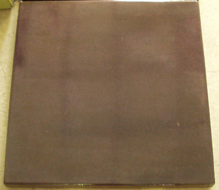
The interference sealer from Dayton is not on the market yet. They expect to release it in about a month, as they are still running UV light resistance tests on it. My friend Roy Snowball in New Zealand sent me a small jar of a different interference pigment in powdered form. We added what he sent us (about 2 oz.) to a pint of Super Seal and stirred it in. We did another paver just like the first, again sandwiching our mixture between two coats of clear sealer. We obtained quite a lovely interference color which ranges from turquoise blue to pink. This effect is not as striking as when we used Dayton’s sealer, so we may have diluted the powder too thinly, or we may be missing some vital ingredient. I could not get a photo of this paver which did not look simply black. In the last newsletter I mentioned the drawbacks of very dark-stained floors. We have the same problem with these pavers. Every time someone steps on them, they leave an obvious white footprint. The interference pigment does not alleviate that problem.
Our next experiment was to try the pigment on a paver stained a medium brown, instead of black. This gives a much less striking look, but it can be perceived. The slab looks like pearlescent copper nail polish, but it does not completely change hue. From one angle the copper color is a bit cooler (more blue) and from another angle it is a redder shade of copper. It is clear that the pigment is working, but it is attenuated by being placed over a lighter-brown background. We took this paver to a home show and found a new client who loved the subtlety of it. She will have us apply it over a light brown stain in her entry hall. This hallway features a skylight, so we are hoping that people will do a “double take” as they walk across the floor and sense a shift in color from certain angles. We anticipate that the color of her hallway floor will also change as the sun moves across the skylight, giving her some variety during the day. The Daniel Smith Company produces all sorts of pigments for artists. Roy sent me a link to their site with an article by Carmi Weingrod called “Three-Dimensional Color” which gives a very clear explanation of how interference pigments work (go to www.danielsmith.com/learn/inksmith/200211/).
I abstract from the article here: Most pigments are one-dimensional. A blue wall will absorb all the colors in the light spectrum except blue. That is the one color which is reflected back and seen by your eyes. Metallic pigments are two-dimensional. They are made with tiny flat pieces of aluminum, copper, gold, silver or zinc and other metals which reflect light the way a mirror does. Interference pigments consist of various layers of a metal oxide deposited onto mica, a natural mineral. Light striking the surface of these pigments is refracted, reflected and scattered by the layers that make up the pigment. Through a superimposition (or interference) of the reflected rays of light, a changing play of color is created, with the most intense color seen at the angle of reflection.
The colors produced by interference are dependent on the angle of observation and illumination, and they will alternate with their complementary color as the angle changes. As a result, interference pigments are considered three-dimensional.
Conventional absorption and metallic pigments display their individual colors even in dry powdered form. But interference pigments, made as they are from two nearly colorless substances - a metal oxide and mica - all have a white to gold appearance in dry form, depending on the metal oxide utilized...
I am very excited by this new discovery. Here is a way to use the same eight colors of acid stain we have always used, and yet add a new dynamic to our floors. Fine artists and faux painters of walls have had access to pearlescent and interference paints for some time. We need to catch up. Our clients understand that we will proceed cautiously with this innovation, but we have to start somewhere to discover how durable and practical these pigments might be on an actual floor. We explain to them that these pigments are still experimental and they can decide whether or not they care to have a portion of their floor serve as a "guinea pig." Another client plans to use these sealers only in two small bathrooms. They like the idea of having a floor finish which their friends have never seen before. Happy Staining! GG |
||||||
|
||||||